
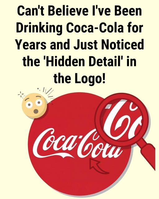
The “Hidden Detail” in the Coca-Cola Logo—And Why People Keep Discovering It
If you’ve ever stared at the Coca-Cola logo and suddenly thought, “How did I never notice that before?”—you’re not alone. The brand’s flowing white script on a red background is one of the most recognized logos in the world, yet people continue to spot details that feel newly revealed, even after decades of seeing it daily.
So what’s the “hidden detail,” and is it actually intentional?
The Detail People Notice Most Often
The most common “discovery” involves the curving letters and negative space within the Coca-Cola script—especially around the letters C, o, and l. When magnified or closely examined, some viewers notice shapes that resemble:
- A smiling face
- A ribbon or wave
- Subtle motion suggesting refreshment or flow
These impressions aren’t literal symbols hidden in the logo, but rather examples of how negative space and elegant curves can invite interpretation.
Why the Logo Feels Full of Secrets
The Coca-Cola logo dates back to 1886, created using Spencerian script—a popular handwriting style of the era. Its design wasn’t meant to hide symbols; it was meant to look friendly, fluid, and human.
Over time, that fluidity has had an interesting side effect:
- The brain naturally looks for patterns
- Familiar designs get reinterpreted with fresh eyes
- Social media encourages “discoveries” to spread quickly
What feels like a hidden message is often just good typography doing its job.
Debunking the Popular Myths
Several viral claims have circulated over the years, including:
- The logo secretly contains a national flag
- Letters form hidden words when flipped or mirrored
- Symbols appear only when magnified
Design historians and Coca-Cola itself have consistently said these interpretations are coincidental, not intentional. The logo has remained remarkably consistent for over a century—long before modern subliminal branding theories existed.
Why People Keep “Discovering” It
There’s a psychological reason these moments feel so surprising:
- Our brains tune out familiar visuals
- When attention shifts (or a magnifying graphic appears), we suddenly see again
- That rediscovery feels like uncovering a secret
It’s not that the logo changed—it’s that our attention did.
The Real Genius of the Coca-Cola Logo
The real brilliance isn’t a hidden image. It’s this:
- The logo is simple enough to remember
- Detailed enough to remain interesting
- Timeless enough to invite rediscovery
Very few designs can do all three.
The Bottom Line
The “hidden detail” in the Coca-Cola logo isn’t a secret message—it’s a reminder of how powerful classic design can be. When a logo is crafted with intention and elegance, it keeps revealing itself in new ways, even after generations.
Sometimes, what feels hidden was just waiting for you to look a little closer.